Contents
Site Design
|
Introduction Site structure Site elements I Site elements II Intranet design Site Covers |
Web sites can vary enormously in their style, content, organization, and purpose, but all Web sites that are primarily designed to act as information resources share some basic characteristics.
Home pages
All Web sites are organized around a "home page," that acts as a point of entry into the complex of Web pages in your site. In hierarchical organizations, your home page sits at the top of the chart, and all pages in your Web site should be contain a direct link back to that home page. The World Wide Web URL for your home page is the Web "address" you will use to point users to your Web site, and the address of your home page could become every bit as important as your street address or department address in the years to come. The top of your home page will be the first thing Web users see when accessing your site (or your whole company, in the case of corporate Web sites), so the proper design of home pages is crucial to the success of your site. Design strategies for home pages vary, based on the function and needs of typical users of the site, the esthetic and design goals for the site, and on nature and complexity of the organization of the Web site as a whole.
Graphic or text menus
The most basic layout decision you will make about your home page concerns how heavily you will use graphics on the page. Most corporate, institutional, and education home pages display at least a small graphic banner across the top of the home page, and in commercial sites the trend is rapidly moving toward menus constructed from complex, full-page graphics the emulate the look and functions of CD-ROM multimedia title pages. While strong graphic can be effective at grabbing a browser's attention, large graphic menus impose long loading times for pages, especially for users linking to the Internet via modems or slower network connections. Even if the user is accessing your Web site at Ethernet speeds (10 Mbits/sec) graphic menus may still ten times slower than text-based lists of links.
Who is the audience for the home page?
This dichotomy between slow-loading but attractive graphics-based home pages and fast-loading but prosaic text-based home pages also reflects the need to address different audiences, with different expectations. The goals for most Web sites are the transmission of internal information (to students, employees, and existing clients) and communicating with potential clients and the general Web-browsing public. Kodak has opted for graphic home page design, but the layout is carefully designed not to exceed the dimensions of the average office monitor. By keeping the graphic moderate in size the page loads reasonably quickly for a graphic menu.

Graphic has been reduced from the original size. www.kodak.com
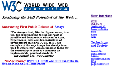
The relatively plain, mostly text-based home page for the W3C offers a very efficient ratio of links per kilobyte of page size, but at some cost in pure visual appeal. The page is fast-loading and well designed for its audience of Web specialists, but would not attract the average browser through presentation alone:

Graphic has been reduced from the original size. www.w3.org/pub/WWW/
Don't choose
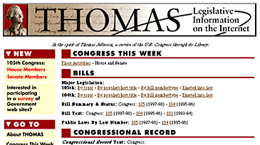
The best way to meet the needs of both casual browsers and highly targeted frequent users is to offer alternative views of your Web site. One approach is to make a visually attractive main home page aimed at the general audience of Web browsers, but also offer a more text-oriented alternate home page that emphasizes rapid access to information via detailed text menus. Another approach is to use a graphic banner up at the top of the home page, followed by a dense set of text-based links. The Library of Congress's Congressional information Web site "Thomas" reflects this dual approach, with a moderate graphic topping a dense but well-organized set of text links:

Graphic has been reduced from the original size. thomas.loc.gov/
References
Eastman Kodak Thomas (U.S. Library of Congress Web site) World Wide Web Consortium (W3C) |