Applied Computing and Engineering Sciences (ACES)
|
School: |
Applied Computing and Engineering Sciences (ACES) |
| Faculty: | Architectural Technology | |
| Course: | ARCH 12356 Architectural Studio 1 |
ARCHITECTURAL LETTERING
 |
PAGE CONTENTS |
Notes and titles are an important part of architectural drawings. Lettering should complement a drawing - not distract or overpower. This module will introduce the 'rules' for proper architectural lettering.
GOOD LETTERING IS:
- neat and easily read
- consistent
- reproducible
- simple and quick to apply to drawing
GOOD LETTERING:
- avoids confusion and errors on site
- adds a professional appearance to drawings
- makes a drawing readable even when old and beginning to fade
RULES TO ACHIEVE GOOD LETTERING:
1. Sizes
Size Used For Metric Imperial Large Titles 6 mm 1/4" Medium Room names and other larger annotations 3 mm 1/8" Small General notations and dimensions 2.5 mm 3/32" Very small Tight areas 2 mm 1/16" 2. DO NOT SLANT
3. Align notes vertically and group them together wherever possible
4. Use guidelines
5. USE UPPER CASE LETTERS ONLY (i.e. CAPITAL LETTERS)
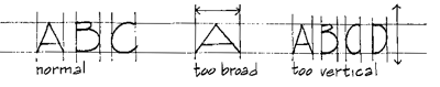
6. Maintain oblong proportions
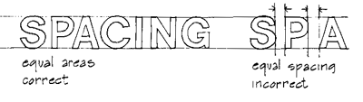
7. Maintain equal AREAS between letters
(NOT consistent spacing)Find a style that meets the above criteria and that you feel comfortable with and practice, practice, practice.
TYPEFACES
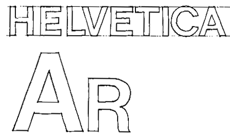
Helvetica medium is a relatively neutral, well-proportioned typeface. Other sans serif (without serifs) typefaces are:
folio medium
standard medium
univers 53
venus medium
Lighter in weight and more elegant in character are:
folio light
helvetica light
microgramma medium extended
Copperplate Gothic
optima stempel
A few sans serif typefaces with relatively heavy weights are:
folio bold
Helvetica bold
microgramma bold extended
univers 75
Similar in weight but with serifs are:
Clarendon bold
fortune bold (and extra bold)
windsor bold