Contents
Interface Design
|
Introduction Basic interface design Access issues Navigation Links & navigation |
User-centered design
Graphic user interfaces were designed to give people direct control over their personal computers. Users now expect a level of design sophistication from all graphic interfaces, including Web pages. The goal is to provide for the needs of all of your potential users, adapting Web technology to their expectations, and never requiring the reader to simply conform to an interface that puts unnecessary obstacles in their paths.
Build clear navigation aids
At the current state of web technology most user interactions with Web pages involve navigating hypertext links between documents. The main interface problem in Web sites is the lack of a sense of where you are within the local organization of information. Clear, consistent icons, graphic identity schemes, and graphic or text-based overview and summary screen can give the user confidence that they can find what they are looking for without wasting time.
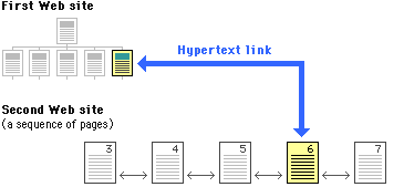
Users should always be able to easily return to your home page, and to other major navigation points in your local site. These basic links, that should be present on every page of your site, are often graphic buttons that both provide basic navigation links, and help create the graphic identity that signals the user that they are still within your site domain. For example, in the Netscape corporate site this bar of buttons appears at the foot of every page:
Graphic has been reduced from the original size. www.netscape.com
The button bar is useful (lots of choices in a small space), predictable (it is always there, at the bottom of every page), and provides a consistent graphic identity to every page in the Netscape site.
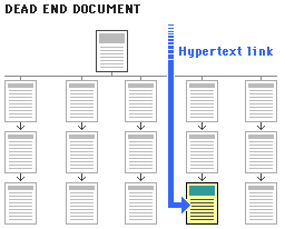
No dead-end pages
Every Web page should contain at least one link. "Dead-end" pages

Apple Computer, Inc. 1992. Macintosh human interface guidelines. Reading, MA: Addison-Wesley. Mullet, K., and D. Sano. 1995. Designing visual interfaces. Englewood Cliffs, NJ: SunSoft Press-Prentice Hall. Netscape Home Page Norman, D. A. 1988. The psychology of everday things. New York: Basic Books. |