Contents
Interface Design
|
Introduction Basic interface design Access issues Navigation Links & navigation |
Give users direct access
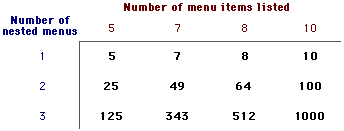
The goal here is to provide the user with the information they want in the fewest possible steps, and in the shortest time. This means you must design an efficient hierarchy of information, to minimize the number of steps through menu pages. Interface studies have shown that users prefer menus that present a minimum of five to seven links, and that users prefer a few very dense screens of choices over many layers of simplified menus.
Bandwidth and interaction
Users will not tolerate long delays. Human-factors research has shown that for most computing tasks the threshold of frustration is around 10 seconds. Web page designs that are not well "tuned" to the network access speed of your typical users will only frustrate them. If your users are primarily general public browsers "surfing" the Web via 28.8 kbps phone line connections it is foolish to put huge bitmap graphics on your pages
Simplicity and consistency
Users are not impressed with complexity that seems gratuitous, especially users who may be depending on your site for timely and accurate work-related information. Your interface metaphors should be simple, familiar and logical to the audience
Graphic has been reduced from the original size. www.adobe.com
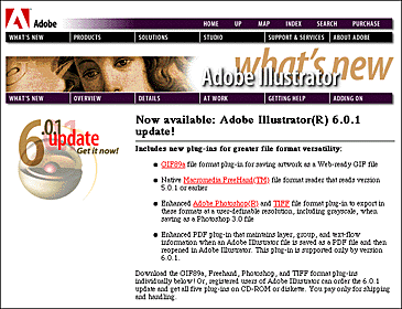
For maximum functionality and legibility your page and site design should be built on a consistent pattern of modular units, all sharing the same basic layout grids, graphic themes, editorial conventions, and hierarchies of organization. The goal is to be consistent and predictable, so that your users will feel comfortable exploring your site, and confident that they know how to find what they are looking for. The graphic identity of a series of pages in your Web site provides visual cues to the continuity of information. The header menu graphics present on every page of the Adobe site create a consistent user interface, and a consistent corporate identity:
Graphic has been reduced from the original size. www.adobe.com
Even if your page uses no inlined graphics, a consistent approach to the layout of titles, subtitles, page footers, and navigation links to your home page or related pages will also reinforce the reader's sense of context within your site organization.
Design stability
If you want to convince your users that what you have to offer is accurate and reliable you will have to design your Web site just as carefully as you would any other type of corporate communication, with the same high editorial and design standards. A site that looks sloppily-built, with poor visual design and low editorial standards will not inspire confidence in your users.
Feedback and dialog
Your Web design should offer constant visual and functional confirmation of the user's whereabouts and options, via graphic design, navigation buttons, or uniformly-placed hypertext links.


Not every user of your site will be able to take advantage of the graphics you offer on your pages, and a number of users may be visually impaired. One of the beauties of the Web and HTML is the ability to build in "alternate" messages ("ALT" tags in HTML) so that users without graphics capabilities can still understand the function of graphics on your pages. Using specially designed software, blind users can hear (via synthesized speech) the alternate messages you supply along with your graphics, and so will not completely miss the content of your pictures and graphic navigation buttons. If you will be using graphic menu systems for navigation, these text-based alternate menus will be an especially important aid to users without the ability to see your graphics.
References
Adobe Corporation. www.adobe.com Apple Computer, Inc. 1992. Macintosh human interface guidelines. Reading, MA: Addison-Wesley. Microsoft Corporation. 1995. The windows interface guidelines for software design. Redmond, WA: Microsoft Press. Shneiderman, B. 1992. Designing the user interface: Effective strategies for effective human-computer interaction. 2nd ed., Reading, Mass.: Addison-Wesley. Studio Archetype |